In this image, we’re going to create a simple text logo using the ‘text’ object in POV and just a little bit of ‘Constructive Solid Geometry’. We’ll finish off the logo by using a photograph as an image map on our object, making the text look like a window onto the photograph.
‘SPX’ stands for Small Press Expo. It is a yearly gathering of small press publishers, creators, and fans and has been held in Georgetown as well as Bethesda. Look at the SPX web page for more information. Also look there for images from the 1997 SPX, which is where I got the photographs for use in the logo. You can, of course, use any photograph you have lying around on your computer.
Text logo thoughts
As it stood the SPX logo was black and white and fairly jaggy. The black and white makes sense, and is a good design call: many, probably most, of the comics discussed at SPX are in black and white. The jagginess did not reflect well on the comics and creators at SPX, however, and that’s what I set out to fix.
First, I needed to choose the font(s) to use in the logo. In this case, I was starting from an already existing logo, so I went through my ‘font catalog’ until I found the fonts that most closely matched the fonts in the logo. In this case, it looks very much like the original logo used Arial Black for the big “SPX” letters and the title “small press expo”, and Arial for the rest of the text. Step one, then, was converting Arial and Arial Black from Macintosh Truetype files into the Windows .ttf files that POV uses. I copied Arial and Arial Black out of my fonts folder, and then dragged the copied files onto TTConverter. If you are using Windows, you will need to merely copy Arial out of your system folder. If you don’t have Arial, you’ll have to find it (it should come with any system that Microsoft has touched recently) or choose a similar blocky font. If you don’t use the same font as I do, of course, you’ll have to modify some of the scalings to get things to turn out.
Place those two fonts into your POV “Includes” folder.
Creating the text
So let’s start putting this logo together! While we’re working on the image, go ahead and turn anti-aliasing off and set the image to 160 by 120.
Here’s our first scene file for this logo. Go ahead and type it in and render it:

[toggle code]
- #include "colors.inc"
-
camera {
- location <0,0,-7.35>
- look_at <0,0,0>
- }
-
light_source {
- <5,15,-50>
- color White
- }
- background { color White }
-
#declare Text_Color = texture {
- pigment { color Black }
- }
- #declare text_depth = .05;
- #declare thick_font = "ArialBl.ttf"
-
text {
- ttf thick_font
- "SPX"
- text_depth,0
- scale <4.25,4.25,1>
- texture { Text_Color }
- }
Well, obviously our image is off to the right way too much. But before we fix that, let’s go over the lines in this scene file.
First, we set the camera to be at the center of the ‘X’ and ‘Y’ axis, and a bit over seven units back on the ‘Z’ axis. And we’re looking straight down the ‘Z’ axis to the origin.
Second, we set the light source to be a light five units to the right, 15 units high, and 50 units back (which ends up being about 43 units behind us). And, we set our light source to be a ‘white’ light.
We set the background color to be white. This means that anywhere in our scene that does not hold an object of some kind will be white.
Now, we’re getting into the fun part:
[toggle code]
-
#declare Text_Color = texture {
- pigment { color Black }
- }
We are ‘declaring’ that wherever we write “Text_Color”, what we really mean is a texture with the color black. In more advanced POV scene files, the ‘texture’ can contain the surface texture (bumpy, wavy, and many more), the surface color (black, white, magenta, etc.), and the surface finish (whether or not the surface is reflective, how shadows affect the surface, that sort of thing). In this case, our texture is merely a color. Color is specified with the ‘pigment’ statement, and our pigment is a solid ‘Black’. By ‘declaring’ our texture, we can, first, save a lot of typing. Instead of typing the whole texture out, we can just type ‘texture { Text_Color }’ and be done with it. But even better, we can go back and change the texture of our objects by changing the single declaration, rather than changing the texture of each of our objects. You’ll see how that works when we get to the photograph.
- #declare text_depth = .05;
- #declare thick_font = "ArialBl.ttf"
We are also ‘declaring’ the depth of the text and the name of the font we’re using for the ‘thick’ font. This way, we can also change our mind here later on if we want to. We can make our text deeper if we want, or we can use a different font.
[toggle code]
-
text {
- ttf thick_font
- "SPX"
- text_depth,0
- texture { Text_Color }
- scale <4.25,4.25,1>
- }
And the meat of this scene, this is the text itself. The format for a text object is ‘ttf’ and then the font name (here, we’ve declared that wherever we use ‘thick_font’, we really mean ‘ArialBl.ttf’). Then, the letters we want this text object to display, and finally the depth of the text and the number 0. (Ignore the number zero for the moment, or read the manual if it interests you. This is for more advanced text objects.)
Finally, we give the object a ‘texture’. In this case, recall, our ‘texture’ is simply the color black. We also scale the text by 4.25 left/right and up/down. Generally, each letter is about .5 to 1 unit wide and .5 to 1 unit tall. The first letter starts with its lower left corner on the origin, or <0,0,0>. The depth of the object moves away from us, and letters themselves are drawn right and up.
This explains why our text is going off the right edge of the scene. We need to move the text down and to the left in order to ‘center’ it. Add the translate <-4.7,-1.25,0> to the end of the text object:

[toggle code]
-
text {
- ttf thick_font
- "SPX"
- text_depth,0
- texture { Text_Color }
- scale <4.25,4.25,1>
- translate <-4.7,-1.25,0>
- }
There! That centers it quite nicely. Now, the next part of this image involves cutting out the number ‘98’ in the lower right part of the ‘X’. We’ll use the ‘difference’ statement to remove the ‘98’ shape from the ‘SPX’ shape:
First, we want the ‘98’ to be white, so let’s ‘declare’ a texture for the ‘98’. We also need to use ‘Arial’ instead of ‘Arial Black’, so let’s declare a ‘thin_font’ to complement the ‘thick_font’:
[toggle code]
-
#declare text_cut_texture = texture {
- pigment { color White }
- finish { ambient 1 }
- }
- #declare thin_font = "Arial.ttf"
Then, we need to move everything into a ‘difference’ statement:

[toggle code]
-
difference {
-
text {
- ttf thick_font
- "SPX"
- text_depth,0
- scale <4.25,4.25,1>
- }
-
text {
- ttf thin_font
- "98"
- text_depth,0
- scale <.822,.822,1>
- texture { text_cut_texture }
- translate <8.165,.01,-text_depth*.05>
- }
- texture { Text_Color }
- translate <-4.7,-1.25,0>
-
text {
- }
It’s already looking a bit complicated, isn’t it? And we haven’t even got started yet! Let’s take it one step at a time.
First, the difference statement. It’s fairly simple on the face of it. Inside the ‘difference’ statement you put a number of objects. The first object is the ‘real’ object. All the remaining objects get ‘cut out of’ the first object. In this case our ‘real’ object is the letter ‘SPX’ and we cut out the numbers ‘98’. each object inside of a ‘difference’ statement can have its own texture, as the numbers ‘98’ do here. Or, if they don’t (as in ‘SPX’ here), they take on the texture of the entire ‘difference’ statement. Look above again if you missed it: we moved the ‘Text_Color’ texture from inside the ‘SPX’ text object and moved it to the ‘top level’ of the difference statement.
We also moved the ‘translate <-4.7,-1.25,0>’ out of the ‘SPX’ object as well, and use it to move the ‘difference’ object around. The ‘difference’ statement specifies an object just like any of the other, simpler, object specifiers in POV do. It specifies an object that is the combination of two other objects.
[toggle code]
-
text {
- ttf thin_font
- "98"
- text_depth,0
- scale <.822,.822,1>
- texture { text_cut_texture }
- translate <8.165,.01,-text_depth*.05>
- }
And the second text object, ‘98’, is virtually identical to our ‘SPX’ text object, except that we use ‘thin_font’ instead of ‘thick_font’, ‘text_cut_texture’ instead of ‘Text_Color’, and we scale it differently. Whereas ‘SPX’ was huge (over 4 times the ‘normal’ size), we need to make the ‘98’ smaller to fit inside the lower right corner of the ‘X’ in ‘SPX’. We also translate it quite a bit differently: we move it a little over 8 units to the right, a tiny amount up, and we move it out (towards us) on the ‘Z’ axis by a tiny fraction of ‘text_depth’.
You would normally, of course, have to use quite a bit of trial and error to get the right scaling and X/Y translation for the ‘98’ object. Note that MegaPOV has special functions for getting the exact size of objects, including text objects. Judicious use of “max_extent” and “min_extent” can make sizing text objects quite a bit easier.
In the ‘text_cut_texture’, you see a ‘finish { ambient 1 }’ as well as a ‘pigment { color White }’. We’ve already seen the ‘pigment’ statement. It just specifies that this object is white. The ‘finish’ statement controls how that pigment interacts with the light coming into it. You could use the ‘finish’ statement, for example, to make your object reflective, turning it into a ‘mirror’ finish. In this case, however, we’re setting the ‘ambient’ of the texture to ‘1’. ‘Ambient’ tells POV how much light this object ‘gets for free’. Even if no light source is illuminating the object, you will still be able to see the object as if that much light was falling on it. You can set the ‘ambient’ to any number from 0 to 1. Zero means that the object will not appear illuminated at all if no light is shining on it. One means that the object will still appear fully illuminated, even if no light is shining on it. In between are varying levels of illumination. In this case, we set it to one: this means that no shadows will hide the text that we’re ‘cutting out’ of other objects. If we give an object the ‘text_cut_texture’, that object will always appear fully illuminated.
Notice that we always scale our text object the same in the ‘X’ and ‘Y’ axis, but by ‘1’ in the ‘Z’ axis. The ‘Z’ axis is just the ‘depth’ of the text. It doesn’t affect what our eyes consider the ‘shape’ of the text for readability. But if we were to scale it differently up/down than left/right, we would end up distorting the text in ways that our eyes probably wouldn’t like. (Feel free to experiment, however!)
Now, why did we translate the ‘98’ object towards us by 5% of the text depth? We did this because we want POV to cut out the object whose shape is defined by our ‘98’ object from the object whose shape is defined by our ‘SPX’ object. But remember that text objects start at <0,0,0>. This means that the front of both the ‘98’ and ‘SPX’ objects are are at 0 on the ‘Z’ axis. Both the fronts and backs of both objects are in exactly the same place. POV has no idea, and can’t know, which one is foremost, because neither one is. You end up with an unpredictable fight between the two objects that you don’t want. By moving the ‘98’ object just so slightly forward, POV does not get into a fight over which surface is foremost in those objects, because the surfaces are no longer in exactly the same spot.
Differences are not the only statements you can use to combine objects. The union statement combines multiple objects into, as far as POV is concerned, one object. The union statement doesn’t make the object look any different: but it allows you to ‘translate’, ‘scale’, and ‘texture’ the objects as if they were one object (because they are) rather than having to perform the same translating, scaling, and texturing multiple times.
Let’s add the “small press expo” text to the top, and make it a union with our ‘SPX’ text:

[toggle code]
-
union {
-
text {
- ttf thick_font
- "small press expo"
- text_depth,0
- translate <0,2.15,0>
- }
-
difference {
-
text {
- ttf thick_font
- "SPX"
- text_depth,0
- scale <4.25,4.25,1>
- }
-
text {
- ttf thin_font
- "98"
- text_depth,0
- scale <.822,.822,1>
- texture { text_cut_texture }
- translate <8.165,.01,-text_depth*.05>
- }
- translate <0,-1.25,0>
-
text {
- }
- texture { Text_Color }
- translate <-4.7,0,0>
-
text {
- }
This is a bit more complicated! We are using the ‘difference’ statement to combine the ‘SPX’ and ‘98’ into an ‘SPX98’ object. We are then taking this ‘SPX98’ object and using ‘union’ to combine it with the ‘small press expo’ object. And, we’ve moved the ‘texture { Text_Color }’ and the ‘translate <-4.7,0,0>’ out of the difference and into the union.
The final part of this image is the white text at the bottom, inside of a black rectangle. We’re going to make this by creating a long black box and ‘cutting out’ the letters ‘September 25-27 Bethesda, MD’ from this box. We will ‘cut out’ those letters using the difference statement, as before.
Here is the boxed text. Put this at the end of your ‘union’ statement, so that this becomes the third (and last) object in the union:

[toggle code]
-
difference {
-
box {
- <-.13,-.16,0>,
- <9.5,.59,text_depth>
- }
-
text {
- ttf thin_font
- "September 25-27 Bethesda, MD"
- text_depth*1.1,0
- scale <.66,.66,1>
- texture { text_cut_texture }
- translate <0,0,-text_depth*.05>
- }
- translate <0,-2,0>
-
box {
- }
Here, we first make a box whose lower left corner (closest to us) is just to the left, just a bit down, and smack dab on the ‘Z’ axis--which is just where all of our text objects have started as well. The upper right corner (farthest from us) is almost 9 units to the right, half a unit high, and ‘text_depth’ units back. So this box is exactly the same depth as our text objects.
We then ‘cut out’ the date and location of this conference from the box, so that it looks like there are white letters cut out of the box. And the reason it looks like this is because there are!
Finally, we scale the entire box so that it’s a bit bigger, and then we move it two units down, so that it is just below our ‘SPX’ object.
And that’s it! That’s a great, simple, stark logo. Of course, it looks pretty ugly un-aliased. Go ahead and turn anti-aliasing on and re-render it. Increase the size to 320 by 240 as well.

That looks quite a bit nicer! You might want to take a break now, come back, and fool around with the objects above. Next, we’ll get into projecting a photograph onto this logo.
- Text logo example
- Text objects are left-aligned, not centered, so you’ll need to do the centering yourself.
- Text logo re-aligned
- You’ll generally translate text objects so that they’re centered or otherwise aligned the way you want them.
- Text logo with year
- Text objects are just like any other object: we can apply them as part of a difference. For example, here we remove “98” from the larger “SPX”.
- Text logo with text header
- Logos will often have different sizes of text, and we can do that in POV-Ray using the scale command. Here we put a title across the top of the logo.
- Text logo with bottom bar
- Text can be used in constructive solid geometry objects along with other kinds of objects, such as the box.
More Information
- MegaPOV
- MegaPOV has some very useful features on top of the cool stuff that Persistence of Vision can already do.
Image Maps
In the second half of this tutorial, we are going to take a photograph and ‘project’ it onto the black part of our logo. Only the black parts will get the photo: the rest of the logo will remain white.
Step one is to find a photo. Go ahead and get any scanned photo you might have lying around. The image should be at least 320 by 240, since that’s the ultimate size of our logo. If your scanned image is smaller than that, POV will have to expand it, resulting in a lower quality image. The image can definitely be larger than 320 by 240, however. This will, to a point, result in a higher quality image!
Step two is to prepare the image. We’ve been working, so far, at two logo sizes: 160 by 120 and 320 by 240. Our logo is designed to work at any size which is 4/3 as wide as it is tall. That is, for every four pixels wide our image is, it should be three pixels tall. Cut out extraneous parts of your image in a way that sets this ratio. For the two pictures I chose from the SPX photo site, they ended up being 404 by 303, and 396 by 297.
Your image should be either a GIF, a PNG, or a Targa file. I usually work with ‘PNG’ files, but in this case the source images were GIFs so I left them as GIFs.
Make sure that your image is in the same folder as your POV scene file. You can also (as I do here) create a special folder inside your POV scene folder to hold possible images. I’ve called my image folder “Images”, and have placed two images in it. One is a picture of some stellar SPX attendees in John Harvard’s Pub, and the other is a picture of an SPX head honcho carving a pig.
Now that the images are ready, we can tell POV to use them. We’re going to use the ‘texture’ statement again, but instead of specifying a color with ‘pigment’, we are going to specify a photo with ‘pigment’! Replace your current ‘Text_Color’ declaration with the following, and go back to rendering at 160 by 120:

[toggle code]
-
#declare Text_Color = texture {
-
pigment {
-
image_map {
- gif ":Images:John Harvard's Pub"
- //gif ":Images:The Pig"
- }
- scale <4/3,1,1>
-
image_map {
- }
-
pigment {
- }
Well, now, that’s an interesting effect. But certainly not what we were going for. It looks like the photo has been reproduced, very tiny, about eight times throughout our image. Let’s get back to that in a minute. Right now I want to go over the new pigment we’ve created.
What we’re basically doing is specifying that the color of our object is to match the color of a scanned image. So, we use the ‘pigment’ statement just like we did before, except that instead of specifying ‘color Black’ or ‘color White’, we specify ‘image_map { FILETYPE FILE }’. The ‘image_map’ statement takes an image and ‘maps’ it onto our object. We have to tell POV what kind of an image it is (gif, png, etc.) and the name of the file. In this case, since we put the images into a folder called “images”, we had to include that as part of the file’s name. (The ‘colons’ are part of the Macintosh filesystem. If you are using Unix or DOS, you will need to get rid of the first colon and replace the second colon with a ‘/’.) We also put two images into the ‘image_map’, but ‘commented out’ the pig using two slashes. Two slashes at the beginning of a line tell POV to ignore this line.
The ‘image_map’ statement maps the image to a 1 unit by 1 unit square. Since our image is not square, but is rather in a 4/3 ratio, we ‘scaled’ the texture by 4/3 in the ‘X’ direction.
Back to our problem, the problem is that, first, the image is only 4/3 unit by 1 unit, when our image is much bigger. The second is that when an image map doesn’t cover an object completely, it ‘tiles’ or repeats itself, across that object’s surface.
Add the keyword ‘once’ to the ‘image_map’ statement:

[toggle code]
-
image_map {
- gif ":Images:John Harvard's Pub"
- //gif ":Images:The Pig"
- once
- }
Well! It’s no longer repeating across the entire image... but all we’ve got showing up is a small part of the ‘S’ in ‘SPX’. We need to ‘scale’ the image a second time to make it as big as our object. We know how many units wide the image has to be; our widest object is the box at the bottom of the logo. The box begins at .13 to the left and ends at 9.5 to the right. That’s a total width of 9.63 units. We’ve already expanded the image 4/3 in the left/right direction, so we need to multiply this 9.63 by 3/4. That gives us 7.2. So, add ‘scale 7.2’ to our image map:

[toggle code]
-
pigment {
-
image_map {
- gif ":Images:John Harvard's Pub"
- //gif ":Images:The Pig"
- once
- }
- scale <4/3,1,1>
- scale 7.2
-
image_map {
- }
We’re getting there! Now our image map goes across the logo all the way to the right, but it’s only showing the top half! That’s because image maps start at <0,0,0> and move up and to the right. We need to move this image map down so that it starts at the bottom of our logo. We know where the bottom is: it’s the bottom edge of our box. We start our box with a bottom at -.16, and then we ‘translate’ it down further by 2, so that’s a total of -2.16. We also start it at -.13 to the left. Add ‘translate <-.13,-2.16,0>’ to the ‘pigment’:

[toggle code]
-
pigment {
-
image_map {
- gif ":Images:John Harvard's Pub"
- //gif ":Images:The Pig"
- once
- }
- scale <4/3,1,1>
- scale 7.2
- translate <-.13,-2.16,0>
-
image_map {
- }
That is much nicer. Let’s go ahead and see what it looks like at full size. Go back to rendering at 360 by 240.
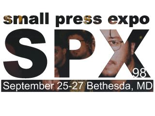
This is quite a nice logo, now, let’s make it ‘cool’. Remember, SPX deals with a lot of black & white works, let’s greyscale this image. In standard POV, you’ll have to use your image editor for that. In GraphicConverter, the ‘Greyscale’ option is under the ‘Colors’ item of the ‘Picture’ menu. If you have MegaPOV, you can use a post-processor to automatically greyscale your image:
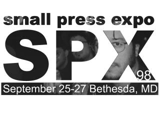
[toggle code]
- #version unofficial MegaPOV 0.5;
-
global_settings {
-
post_process {
-
color_matrix {
-
<0.3, 0.59, 0.11,
- 0.3, 0.59, 0.11,
- 0.3, 0.59, 0.11>
-
<0.3, 0.59, 0.11,
- }
-
color_matrix {
- }
-
post_process {
- }
Note also that if you are using MegaPOV 0.5, you’ll need to use a PNG image instead of a GIF image.
The “color matrix” modifies each color according to the amount of red, green, and blue within that color and the red, green, and blue multipliers given in the matrix. The above values convert each color to a greyscale equivalent.
- Text logo with repeating image
- By default, image maps repeat every one unit.
- Text logo with non-repeating image
- Without a repeating image over the logo, only a tiny (one-unit square) section of the logo remains.
- Text logo with half-size image
- Resizing the image to the size of the logo almost works: we now see the upper half of the logo.
- Text logo with image fully corrected
- Scaled and translated, the image now fully covers the text logo.
- Text logo with greyscale image
- Using MegaPOV, you can post-process images. Here, we convert it automatically from color to black and white.
Play Around!
If you have more than one image you’d like to try mapping onto your logo, go ahead and do them now. Here, I ‘commented out’ the pub image and ‘uncommented’ the pig image:
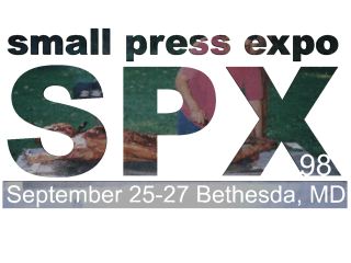
There is a lot more to image mapping than this, and I hope to get to that in a later tutorial. You can map images onto any surface you want. You can have them wrap around cylinders or even around spheres.
- Text logo with different image
- Once you’ve got image maps down, you can easily switch out images as appropriate to the occasion.
More Information
- Small Press Expo
- “SPX has a unique format of only selling exhibitor space to independent publishers and not to retailers. This provides a very intimate and friendly atmosphere for our creators and fans to mingle. At the same time, there's a wide array of programming for all to enjoy.”
