iLife ’06 Review: The Good and the Ugly
The iLife• package of multimedia applications is one of the major draws of using a Macintosh. The new iLife ’06 adds quite a few features to this suite, as well as a new application. I’m mainly going to focus on GarageBand, iPhoto, and iWeb, because I bought it for the new GarageBand and iPhoto, and I had hopes for iWeb.
GarageBand
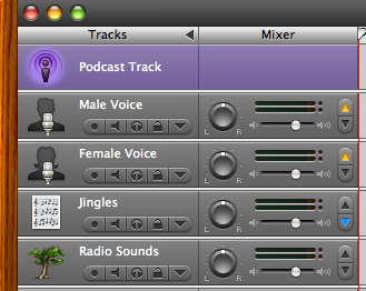
I purchased iLife mainly for GarageBand’s new podcasting features, and it was worth it. Making podcasts in GarageBand is now something that GarageBand is designed for. GarageBand assumes that your podcast will be a video podcast, but you can delete the video track. Besides the photo or video track, if you tell GarageBand that you are making a podcast, it creates a male voice, a female voice, a jingles track, and a radio sounds track.
The video track is very useful if you are doing a video podcast or if you are scoring or making a commentary for a movie or a series of photographs. It allows you to carefully synchronize your GarageBand audio to your movie or photographs. You can pull in movies from your Movies folder, from iTunes, or by dragging it from the Finder.
GarageBand now takes control of the full podcast process. It can export as AAC to iWeb or to a file (check your preferences), instead of having to export to iTunes so that iTunes can convert to AAC or MP3. There does not appear to be a way of telling GarageBand to export as MP3. This isn’t a big deal, because I use iTunes for archiving my podcasts anyway, but it is annoying.
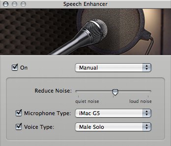
Noise reduction is very useful, but not labeled as noise reduction. “Male Radio Noisy” and “Male Narrator Noisy” reduce noise a little, but keep the voice natural. “iSight Microphone Male” reduces noise a lot, but also makes the voice less natural. There are, of course, equivalents for “Female”, and you can also go into “Speech Enhancer” and make changes manually. I found that very useful for FlameWar.
Noise reduction is not as good as noise removal in Audacity. It is, however, easier to use, especially if you plan on doing your initial editing in GarageBand. Where Audacity’s noise removal appears to remove noise equally in quiet spaces and during speech, GarageBand’s speech enhancer seems to remove more noise during quiet spaces, making for an odd effect at higher volumes.

Speech Enhancer will reduce background hum in vocal tracks.
You can switch between these different settings at any point; all audio in the track will automatically and immediately reflect those changes. GarageBand keeps the original audio and applies the filter you choose at playtime.
The built-in sound effects provide exactly what I was looking for in FlameWar: some computer-oriented sound effects to mark the beginning of a news item. There are quiet a few others as well, for crowd noises, machine noises, traffic noises, and various other background noises.
iPhoto
iPhoto looks pretty much the same as before, but it does feel a lot snappier. Also, it appears to crash much less often--when it runs across a corrupted image, it just displays a blank image. And I haven’t (yet) hit the spinning rainbow of death. I used to get it occasionally when viewing images at maximum size, so that only one showed up at a time. Now it’s a lot easier to scroll through photos to rate and categorize them.
The new full screen mode is nice, too. You also get (when you move your mouse to the top of the screen) a row of images to choose from. Move the mouse to the bottom and the editing buttons will pop up. Unfortunately, in full screen mode smart albums will not automatically update themselves. I’ve made a smart album of nothing but unrated photos, for example, and when I’ve got a little bit of free time (or when I’m reviewing the suite...) I go into that album and start rating. Normally, as soon as I rate a photo it disappears from the smart album--since it is now no longer an unrated photo. That automatically brings the next photo into view. In full screen mode, that no longer happens. Hitting the right arrow is only one extra keystroke, but it does make a difference.
One new feature that I know some people will enjoy is that iPhoto no longer has to copy photos to its own folder. It now works like iTunes: by default, it will copy any photos added to its own area, but you can turn this off.
The slideshow feature still doesn’t quite work: if I set it to fit to the music and not repeat, the music still tries to repeat at the very end.
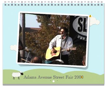
Calendars could be a nice feature: they act like any other album, except that, like books, you can drag and drop images from the album into a calendar area. However, it relies heavily on iCal for dates, and it does not appear to throw out alarms. I have a whole bunch of calendar days with the words “alarm notification” written on them. Other than that, however, the calendars look great, and you can print them out or order assembled calendars on-line.

Calendars are one of the nice new features for iPhoto ’06.
Similarly, the new cards feature can print out very nicely on 8.5x11 paper, if you have a color printer.
The new iPhoto feels a lot faster and a lot smoother than the previous version. All in all, it’s worth upgrading.
iTunes
The main change in this version of iTunes is the addition of an iTunes mini-store. It shows up at the bottom of the iTunes screen and recommends music you might like based on what’s playing. While this ministore in iTunes 6.0.2 comes with privacy concerns, I actually like the concept, but it takes up far too much space. If (like me) you prefer to have the browser open at the top of iTunes, having the mini-store open on the bottom reduces the available space for scrolling through tunes far too much, even on the 20-inch iMac G5.
Get rid of it by clicking the up-arrow immediately to the left of the equalizer button in the lower right of the iTunes window.
iWeb
Wow. As great as the iLife applications have all been, I was looking forward to seeing what iWeb did. Fortunately, iWeb was not the reason I purchased iLife ’06, because iWeb sucks. Really sucks. I’m talking worse than Front Page. Even Microsoft Word produces more useful web pages than iWeb does.
Now, iWeb produces very beautiful web pages. The problem is that they seem to be completely image-based. The text is all rendered to images, and the images displayed on the browser. Even with the alternate text provided for the images, alternative browsers are likely to completely choke on them. Even alternative browsers such as search engines.
A little background is necessary here. Web pages are made up of tags that describe what purpose each part of the web page holds. There are paragraphs, headlines, emphasized sections, quoted sections, lists, and more. Search engines and other alternative browsers can use these to figure out what the web page “means” to them. Search engines, for example, use these tags to rank web pages. A page with the headline “Jerry Stratton” is more likely to be a web page about Jerry Stratton than is a page where Jerry Stratton is mentioned once in a paragraph somewhere.
The advantage of a good web page editor is not just that it makes beautiful web pages, but that it handles this tagging for you. So that the blind can still read your web pages, so that smaller browsers and older browsers can read your web pages, and so that search engines can rank them correctly. iWeb completely punts on that. The pages that iWeb creates have none of these tags. There are no headlines. There aren’t even paragraphs. Within your content, there are only two tags, and they are the empty tag “div”, which means practically nothing, and the image tag “img”, which generally can’t be read by any sort of alternative browser, including search engines. This means that iWeb-created pages are likely to always be ranked lower than anything else with similar content. Even lower than Microsoft Word-created pages.

About the best a search engine can hope for from an iWeb page.
Here is an example of what I’m talking about. I’ve made the page as simple as I can, so as to make it clear just what is happening. Make sure you view both pages.
Some alternative browsers probably won’t even show something as “nice” as the second example above: all of that text is contained in the alternate text for the image. If the browser doesn’t care about images--as I suspect some search engines don’t--then all that the browser will see is a blank page.
For web pages that you don’t expect anybody to find and you don’t care that they can’t find them, iWeb is probably fine, but why? For any even remotely professional or social web page that you expect people to read, iWeb is nearly worthless.
The iLife bottom line
The iLife suite remains a strong software package for managing audio and photographs, and for creating audio and movies. At $59 to $79 depending on whether you can snag an educational discount, it is definitely worth an upgrade from an iLife of two versions back. If you rely heavily on iPhoto, or if you use GarageBand to make podcasts or movie soundtracks, you’ll want to upgrade even from the ’05 version. Do not buy it for iWeb. Try something like Karelia’s Sandvox instead. Although they’re currently in heavy beta right now, it appears that their end result will be a web page editor that is both useful and pretty.
Remember that all of the iLife applications come with any new Macintosh. If there is a new Macintosh in your future, you’ll probably want to hold off until then and save a few bucks.
- Apple iLife
- “iLife ’06 is the easiest way to make the most out of every bit of your digital life. Use your Mac to collect, organize and edit the various elements. Transform them into mouth-watering masterpieces with Apple-designed templates. Then share the magic moments in beautiful books, colorful calendars, dazzling DVDs, perfect podcasts, and attractive online journals.”
- iLife•
- Apple’s iLife contains GarageBand for making music and editing sounds, iPhoto for managing photographs, iDVD and iMovie for making movies and DVDs from those movies, and now iWeb for making some very pretty (but nearly useless) web pages. It also comes with iTunes for managing music, but iTunes is also a free download.
- An example of an iWeb web site
- This is an example of what an iWeb web site ends up looking like. Make sure you also view the version that search engines see.
- What search engines see when visiting an iWeb site
- This is what search engines and other alternative browsers see when visiting an iWeb-created site. This is worse than even what Microsoft Word creates.
- MiniStore in iTunes 6.0.2 comes with privacy concerns
- “Sounds like a nice feature, except for one thing: the license for iTunes 6.0.2 nowhere mentions that the software is sending information about your listening habits back to Apple.”
- Now podcasting FlameWar!
- FlameWar: The Passion of the Electric Messiah is my latest novel. I’ll be podcasting the latest draft one episode a week.
- Sandvox
- “Sandvox makes website creation elegant, intuitive and fun. It's the Macintosh way--the way it should be: drag and drop content, watch your site take shape as you create it, and publish. Sandvox makes it easy to keep in touch via the Web with friends, family and customers.”
More Apple
- Apple’s FiVe Minute Crush
- Between 1984 and 2024, Apple’s advertising has gone from ridiculing 1984 to being 1984.
- Apple’s spinning mirror: exploiting children for dictatorships
- Apple has decided on “child porn” as the root password to disable privacy on their phones. But the system they’re using appears to be mostly worthless at detecting the exploitation of children, and very useful for detecting dissent from authoritarian governments.
- How does Apple’s supposed anti-conservative bias matter?
- If you think Apple has a bias against conservatives or Christians, you definitely don’t want Apple to build a tool its employees can use to help guess an iPhone’s password.
- We have met the enemy, and he is our carrier
- If you want a phone that works as well as your Macintosh, you need a network that works as well as the Internet.
- Stephen Fry on iPhone killers
- “You’re only on this planet once—do something extraordinary, imaginative and inspiring. That’s the difference, ultimately.”
- 19 more pages with the topic Apple, and other related pages
More cool software
- Smultron text editor
- Peter Borg’s new open source text editor features tabbed windows, split views, remembering multiple open files, and dividing files into projects.
- Persistence of Vision tutorial
- A step-by-step tutorial, available under the Gnu Free Documentation License, on using the Persistence of Vision raytracer.
- Importing vinyl into iTunes
- This script takes songs split by marker from SoundStudio and converts them directly into iTunes, setting track number, track total, and album name along with the song title.

